Consider this the penultimate step in ridding our house of the horrific wall texture that some former owner thought was a good idea. When we bought the house, every room other than the kitchen was covered in this thickly applied drywall compound applied in a fashion similar to one of those really fluffy cakes. Most of it went away when we did our big renovation and discovered that we had to shore up the living room ceiling (the weight of all that drywall compound contributed to a serious sag). I was more than happy to have to redo the drywall.
Then two years ago I did the hallway myself, mostly with a belt sander. For the record, even though it turned out pretty well, this was a really bad idea (I think I still cough up drywall dust).
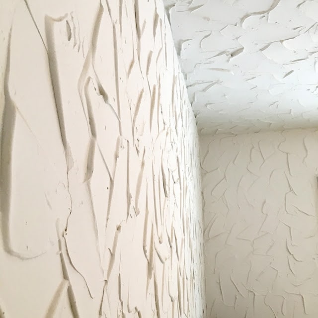
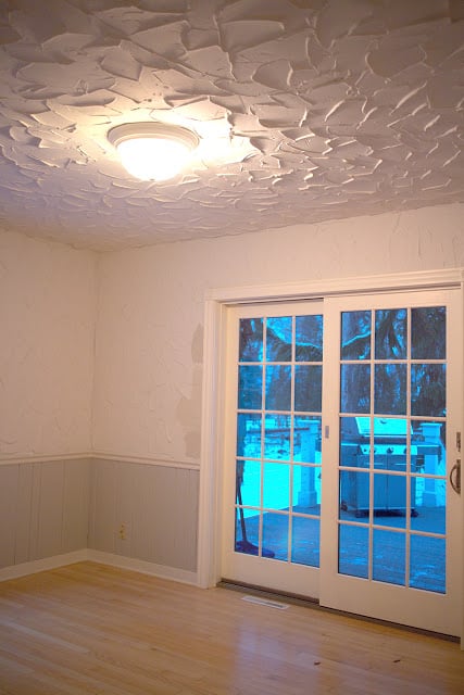
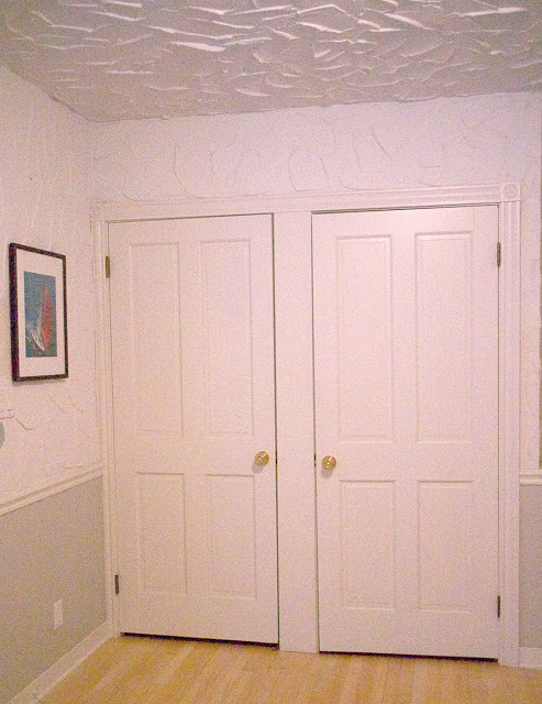
The back room, aka the office, aka the original master bedroom is the worst room in the house as far as the texture goes. Our theory is that they started in that room and then “refined” their technique, because the swoops are really close together and it’s all over the ceiling. There is a distinctive lemon meringue pie vibe in that room.
Here’s what it looked like before this all started.
|
|
| Things you should note about this photo: 1. The horrible wall texture; 2. The boob light; 3. The paint color samples on the wall, because at some point I thought paint was going to fix the problem in there. The sliding doors (which honestly I don’t love but true French doors just aren’t practical in our climate) lead out to the deck. |
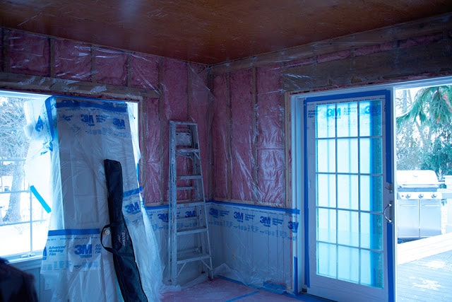
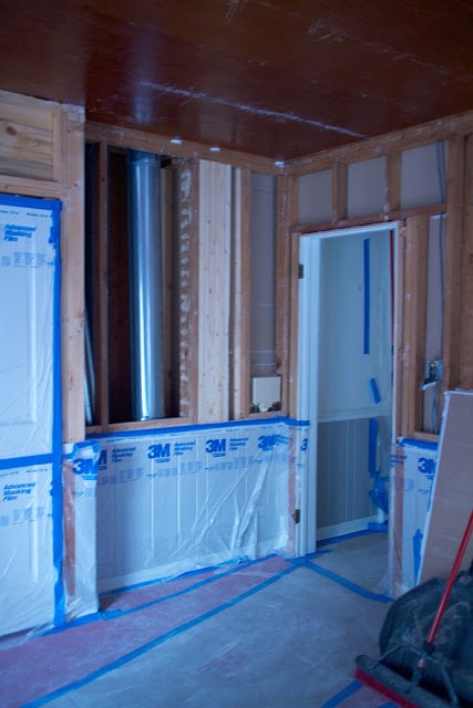
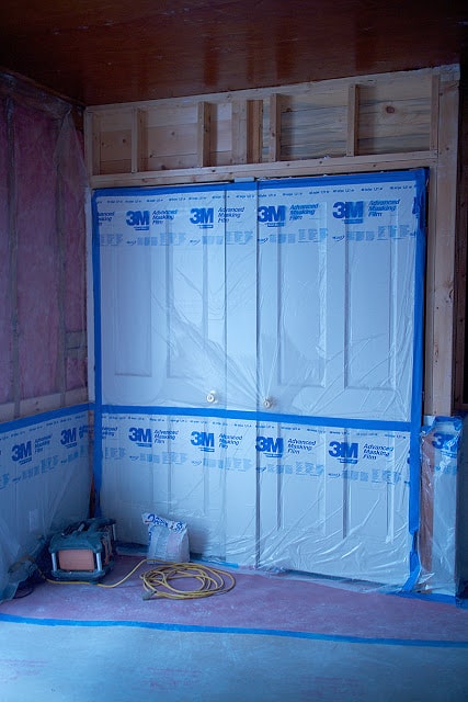
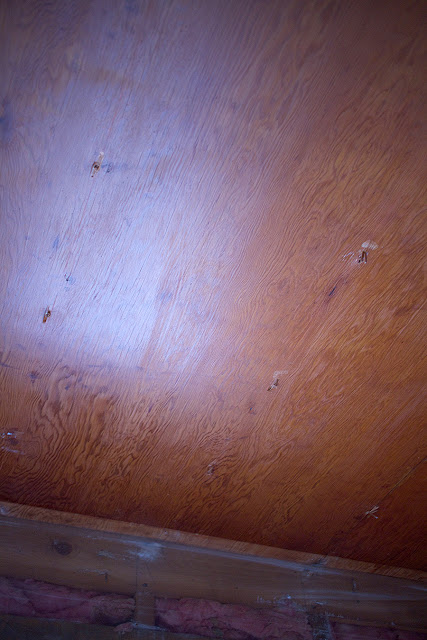
So we’re having that room re-drywalled from the original wainscoting up. The ceiling will be replaced with painted wood planks like in the kitchen. All this came about because at some point we had a leak on the chimney and the ceiling drywall was damaged. We feel fairly confident that we’ve fixed the leak so it was time to fix the drywall and it only made sense to have both projects done at once.
One thing I learned with our big renovation (and subsequent kitchen redo) was that if you can avoid getting your head set on an end date, you’ll be a happier person, so I haven’t asked about one nor really thought about it much. I will eventually, and I’m happy to see that they are working quickly, but for now I don’t want to stress about it.
I’m doing all of the painting in this room and even though it’s a small room, there’s a lot of fiddly painting to be done. The wainscoting, which matches that in the living room and hallway, needs to be sanded, primed and painted because when the previous owners painted, they didn’t sand or prime anything so if you so much as nudge the woodwork, the paint chips off. If I can paint really fast, the wood ceilings will be painted before installation and then just touched up after, which is far preferable to doing it after (as I found when I thought I crippled myself permanently painting the kitchen ceiling). I can’t hold up the installation though, so they’ll go up when the guys are ready to put them up regardless of how far I get. There’s also a ton of trim—chair rail, baseboard plus trim around four doors and a window—and three doors plus the new walls.
This is a bright, sunny room that functions as an office, sitting room and walkway during the summer when we’re on the deck and want to take a more direct route to the bathroom or living room. It can have a nautical bent, sort of. This is the room where we hang two huge nautical charts (one of the Great Lakes, which was was the first Christmas gift I gave Mr. Much More Patient many years ago, and that we still refer to on occasion, and another of Lake Michigan that details the course the boat Mr. Much More Patient was sailing on when it won a very big sailboat race), so it has a little bit of a nautical bent.
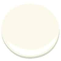
The wainscoting, trim and wood ceilings will all be painted the same warm white that is in much of the rest of the house: Benjamin Moore Mascarpone. I like to keep the same white going where possible for simplicity’s sake not to mention continuity. The upstairs bathroom and kitchen are both Cloud White because I needed something just a touch whiter and the downstairs bathroom will be White Heron because I am attempting to match the subway tile color as closely as possible.
So, would you like to weigh in on a wall color choice in this room? I have it narrowed down to a dark navy (shocker) or something in the light blue / turquoise / aqua area. Unless one of you has a completely different idea that I haven’t thought of.
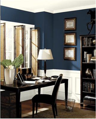
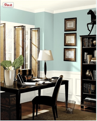
Here’s a navy combination (using BM North Sea). The mock-up is just a generic room from the Benjamin Moore website, not the actual office.
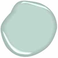
And here’s something a little lighter (and perhaps less serious) with Benjamin Moore Galt Blue (from their Williamsburg collection, which has some great colors in it).
(function () {
var opst = document.createElement(‘script’);
var os_host = document.location.protocol == “https:” ? “https:” : “http:”;
opst.type = ‘text/javascript’;
opst.async = true;
opst.src = os_host + ‘//’ + ‘www.opinionstage.com/polls/2321427/embed.js’;
(document.getElementsByTagName(‘head’)[0] ||
document.getElementsByTagName(‘body’)[0]).appendChild(opst);
}());
Thanks for weighing on the color choice! I’ll keep you updated on the progress back there.




6 Responses
Wow that texture was intense…not sure I could have seen past it. Since the room is light filled I think it can stand up to a dark rich tone one the walls, can't go wrong with a nautical blue. I think the lighter blue is too washed out if looking for an alternate color I would look at the teal Caribbean blue…but the "navy" you selected is more Great Lakes 🙂
Love the dark navy. Just fyi: we used BM "Mysterious" in our house and love it. Might be darker than what you have here? But with white woodwork it looks fab. Just stay away from the lighter blue!
love the navy. Will your nautical charts show up OK on something dark? If it is a sunny room i think a dark color will be fine. Then again, I never met a gray I didn't like!
We've got a dark navy over white wainscoting dining room. We love it. Granted, our whole house is done in shades of blue, grey, and green so maybe I'm a bit biased.
I would go with the North Sea. It has so much depth. The other color looks like a baby's room.
Yikes. That is some awful texture.