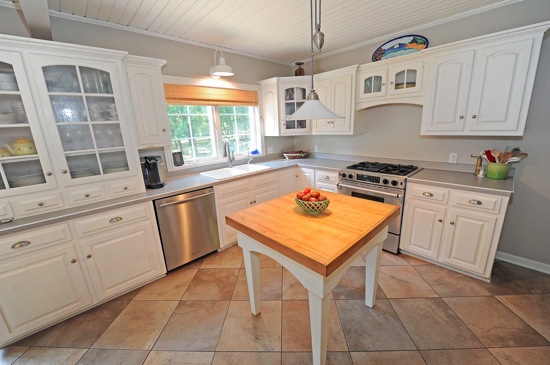
From a room that didn’t even exist a year ago, our tour moves to the kitchen, which has had some modifications made over the years but is largely the same as it was when we bought the house.


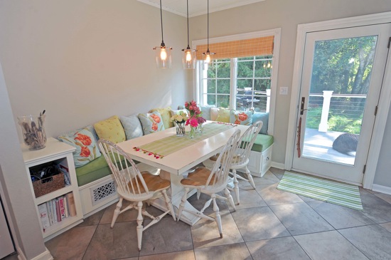
The cabinets, countertops (laminate, but not bad looking, and very easy to keep clean) and window treatments haven’t changed. We did replace the white vinyl kitchen floor with porcelain tile, bought new appliances, moved the laundry out of what should have been a pantry and made it back into a pantry (next to the dividing wall between the eating and cooking areas, shown just in the bottom left corner of the second photo). I also painted the walls and the paneled ceiling, which was sort of pickled pink.
The eating area has changed quite a bit. We took it from a round table that seated four people and stuck out into the walkway from the back door (the most frequently used entrance) to a banquette that can seat seven or more. We still badly need a piece of art on that wall, but I’m picky about art and haven’t found the right thing for that spot.
Paint
- Walls: Benjamin Moore Revere Pewter
- Trim, ceilings, banquette, table: Benjamin Moore Mascarpone AF-20
- Cabinets: Unknown color badly in need of painting, but it’s close to Benjamin Moore White Dove
Sources
- Banquette: Custom made (if you are local, contact me for information)
- Banquette fabrics: www.fabric.com, www.joann.com
- Entry rug: Dash & Albert indoor/outdoor (highly recommended, washes up bright white in the washer)
- Table: Restoration Hardware Outlet
- Chairs: Existing
- Eating area lights: Velocity Art & Design
- Butcher block light: Pottery Barn (several years ago, I don’t know if they still carry it)
- Sink light: Barn Light Electric
Here’s a roundup of some of the projects we’ve done in the kitchen:
- Some befores and general overviews
- Easy art
- Dog feeding station
- Table tutorial here and here
The future of the kitchen:
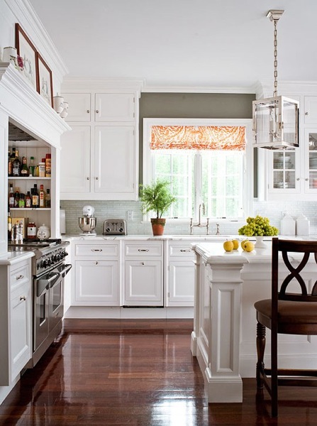
I’m not finished in here yet. At the very least the cabinets need a coat of paint, but I’m not satisfied to stop there. Once we’ve recovered a bit financially from the renovation, we’ll do some sprucing up in here. What we do will be largely driven by budget, but ideally, I’d like to continue the cabinets all the way up to the ceiling by adding another row of cabinets on top of the existing cabinets sort of like this:

via Pinterest
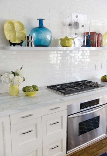
There is nothing wrong with our cabinet boxes, so I'd keep those, but if the budget allowed, I'd have them refaced, skipping the arches that are seen on the top cabinets. I'd also like to turn some of the lower cabinets into drawers if possible. And then, of course, I'd like new counters, but every day I go back and forth on what those might look like. I'm pretty sure I'd pick a quartz though, as I'm thrilled with how our bathroom counter has performed and as beautiful as marble is, I'm not a person who would be satisfied with a counter that gets "a patina." And last but not least, I'd add in a backsplash, probably some variation on classic subway tile like this elongated tile:
 via granitegurus.com


4 Responses
Love the fresh feel of your kitchen, especially the eating area with the big glass door. There's nothing like sitting on a sunny morning and being able to look out the window to the garden.
Found your blog from a comment on "Colour Me Happy". Will have to look at Mascaparone as a trim choice.
I love the lighting over the table! I want to use something similar for our kitchen island some day. I'm saving this for later.
Katie,
I truly believe that it's true that laying tile on a diagonal makes a room look larger. It certainly worked in that room. Bummer that it didn't happen in your kitchen. And tile is so … permanent.
Love that you laid the tile on the diagonal! I wanted to do that in the kitchen bur somewhere communication broke down between our realtor, the construction manager, and the sub-contractor and they laid the tile before we could specify.
I am definitely going to get a daninote iPhone case but I cannot pick! I'm leaning toward either the aqua or yellow chevron.