Since I’ve blabbed on about it for a bit now, I thought I’d share with you some of the vision for what the room looks like. You’ll notice on the photo below that there are no lights. That’s because, just as I was ready to order from an Etsy shop, the store just flat out disappeared. I’m not sure what’s going on with that, but maybe I dodged a bullet there. Also, the shower pan showed up on a semi on Tuesday but it was cracked so it had to be sent back. Like I said: Little stuff, but weird.
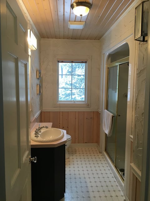
Just to refresh your memory about what this horrific bathroom looks like, here it is in all its bad early-90s glory. You can probably understand why we declared it “the first room that had to be fixed” when we bought the house 13 years ago. This room has it all: pink countertop (I painted the vanity a couple years ago to improve on the pickled finish), lemon meringue pie wall texture, peeling vinyl flooring, cavelike shower with gold sliding door and, of course, a boob light. Other than the doors, nothing in this room is staying.
It’s certainly not the worst bathroom that has ever existed, but it’s up there. I should add that there is a grossness factor as well. That thick wall texture collects dust and what I think is mildew and the wainscoting was never painted. The ceiling is also pickled pink.
Let’s not linger on that image for long. Here’s the plan.
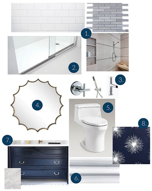
- Shower tile plan: I’m keeping it basic and inexpensive with plain 3×6 white subway tile in the shower and as wainscoting around the room. I’ll break it up a little by inserting thin gray Bardiglio marble tiles as stripes, similar to the photo of the shower. Finding the marble was difficult because the first two things I picked out were discontinued, but then I found a few sheets at a store in New York who sent them to me. I don’t need much because I get 18 linear feet per sheet.
- Shower base: I went back and forth on it, but decided to go with an acrylic shower base. This one is filled with resin (or something) so it feels nice and solid. It will save us a little money over a tiled shower floor, but most of all, I just didn’t want to deal with cleaning a shower floor. I like that this one has a super low threshold that’s only about 1.5 inches tall and the tiled walls go over a flange right up to it.
- Although natural brass is de rigueur, I’m just now warming up to it and I’m not entirely convinced I’ll still like it in a year or two or 10. Chrome, to me, will always be there. It’s not flashy, but it’s practical. Also chrome fixtures cost less than other finishes. There will be a regular showerhead and cross-handle valve trim in the shower (because I like cross handles and dammit, I just wanted them), as well as a hand shower, mostly because I don’t know how you are supposed to clean a shower without a hand shower. It will also allow me to use it to water plants and maybe wash the occasional dog. Mr. Much More Patient picked out the Toobi faucet, which is diminutive and should fit on our very skinny vanity.
- This scalloped mirror is a splurge item, but I feel like it’s key to giving some pizazz to an otherwise rather vanilla room.
- Yep, it’s toilet. Let’s not get too excited.
- OK, now we’re getting to the fun stuff. This is the star of the show as far as I’m concerned. The specific marble I’m getting is called Fluid, but really it’s just a name of a marmara marble. We’ll do it in a honed 6×18 tile set in a perpendicular herringbone pattern (meaning it will run parallel to the walls rather than at a 45-degree angle). I absolutely love it. My mother absolutely hates it. I told her she’ll just have to use the upstairs bathroom.
- This is sort of the inspiration vanity for what we’re having built. Because we need a really narrow vanity to avoid the bumped-out variety of vanity we currently have in the room, I’ve designed something that will be long on legs (we have a large linen closet in the bathroom for the majority of storage) and painted navy. It will be topped with a cararra marble top. If you’re counting, that’s three kinds of marble in one small room, which I’m sure breaks some kind of design rule, but I’m beyond caring.
- I’m considering using this fun fabric for a roman shade for the window to bring a little playfulness into the space.


6 Responses
Could you share the paint color on the vanity? Gorgeous!
Such stylish picks! That mirror is chic, Erin. And I happen to love gray, white and navy – more, please!!!
From the looks of things it will be classic and beautiful. I had to laugh at the comment to your mom! 🙂
We await the reveal — good luck with everything! -Beth
I can't wait to see the transformation!!! Love that mirror! It will definitely be the star of the room. And I love the idea of the herrringbone marble. I thought of it for our new bathroom. But it's such a small space, it would look too busy.
The fabric will be great with that mirror. I spent ages picking out a toilet that would flush anything, had a pull-off seat so you could really clean the hardwear and a fairly simple profile for easy cleaning as well. The toilets in both bathrooms are squeezed into spots that barely meet code today and are hard to clean.