But I am going to play along as a guest participant and do my own private One Room Challenge and link up other bloggers doing it on their own. If you know me and my habit of not really finishing projects, you know this is possibly insane. On the other hand, maybe having a real deadline will make this happen.
And the project I’m choosing is one I’ve already mentioned: the downstairs bathroom. To refresh your memory about this room, let me sum up its history. When we looked at the house before we bought it, both Mr. Much More Patient and I said that renovating the bathroom was at the top of the list. Fourteen years and a massive renovation later, the bathroom is the only room in the house that remains untouched. I did paint the pickled pink vanity a couple years ago, but I had no desire to put any other effort into fixing up this room because I knew that no amount of lipstick could pretty up this pig.
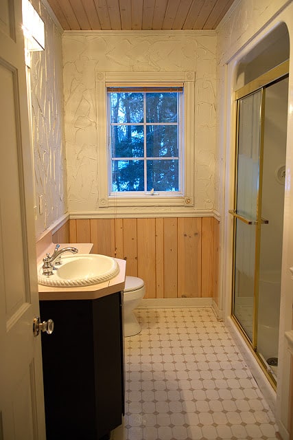
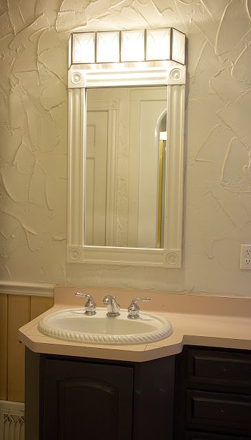
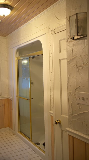
Here’s the kind of ugly we’re talking about. Pickled pink paneled wainscoting and ceiling, more of that horrific wall texture (and if you thought it was bad in the rest of the house, you have no idea how gross it is in a bathroom from a dust/mildew perspective), vinyl floor, pink laminate counter, rope sink, fake gold shower door, plastic shower insert, boob light, ugly lights and more.
One benefit of waiting to redo the bathroom is that we now have a second bathroom upstairs, so the pressure is off as far as showers and running water goes.
Since this is our downstairs bathroom, it serves as our main guest bathroom and of course we use it occasionally as well. Because of that I wanted it to be a little exciting and I wanted to do a few of the things I didn’t do in the upstairs bathroom. For instance, I want marble. No, it’s not particularly practical, but I’ve done practical everywhere else in the house and now I just want some pretty, even if it’s at the expensive of practical.
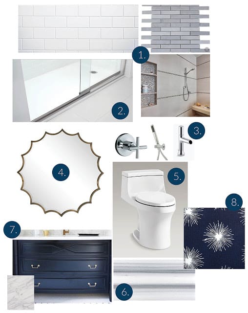
So here’s the plan.
Go to this post for more details on each element, but I think it’s pretty much self explanatory. Bright, light, and everything that the current bathroom is not is pretty much what I’m going for.
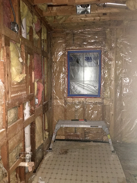
So off we go. And why waste time, because this has already happened.
Come back next week for an update on this space, and in the meantime, check out the bloggers officially participating in the One Room Challenge and all of the other folks playing along as guest participants.



16 Responses
Wow! No offense but you win the prize for "before" board is awesome It's going to take a while for me to quit wondering how that texture on the walls ever came to be LOL Your inspiration board is fantastic! Can't wait to see it all come together!
Wow! We've just started on the bedroom but it's only in the planning stage (I'm still drawing it) so it won't be done in six weeks or I'd be joining in. Good luck, it's going to be SO much better than your old bathroom.
Cool. Can't wait to see the progress and the end result when you finish. Good luck with everything! -Beth
Usually I say that a renovation has to look worse before it looks better. Not in this case!! Even the studs and insulation look better than that awful textured wall. It looked like a bad Italian restaurant from the 70's. Love the choices you're making – it's going to be beautiful!!!!!!
Ooooh- love the picks you have for the bathroom. And man, that bathroom was a doozy! Looking forward to watching this progress.
Such an amazing project! And that mirror! With a room this pretty I'm sure you'll find excuses to use it all of the time 🙂 Best of luck and can't wait to see how it turns out!
I love your plan. Would you share the source for the mirror? Didn't see it on the other post. Thanks!
Hi Samantha! Absolutely … sorry about that. I found it at Scenario Home. Here's a link: http://www.scenariohome.com/products/scalloped-round-copper-mirror
We adore our renovated bathrooms. Nothing more satisfying than this kind of update. It took us 16 years to do the room we said we'd do first.
Funny how that happens, isn't it? Maybe we're just saving the best for last.
This will be fantastic.
Thanks Alana! I sure hope so.
Ooooh. Loving your palette. Good luck!
Thanks SAJ! Glad you think so … makes me feel like I'm on the right track.
Wow! You are taking on quite the renovation. The before really was outdated, I can't wait to see the final result!
Melissa
Super ugly, right? Like the late 1980s/early 1990s blew up in there.