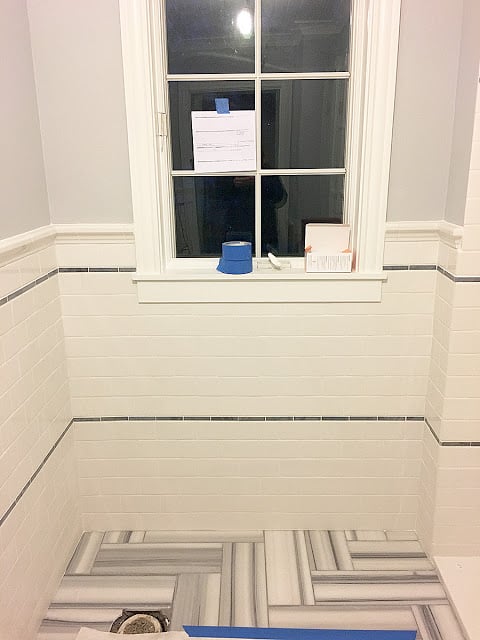
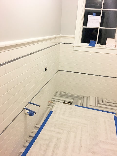
There were a couple of factors that came into play with the selection of the wall tile. This bathroom was always going to be all about the floor, so everything else had to play second fiddle. I also wanted to keep the cost down in order to keep the overall tile cost down. Subway tile came to mind pretty quickly and came with the added bonus of being period appropriate to our 1938 house.
Of course I would have loved a subway tile that was hand-glazed and had a little more character, but price was a huge factor and I went with your basic Dal-tile subway tile that you can find at Home Depot. Well, sort of. There are three shades of white in Dal-tile’s Rittenhouse Square line: the basic white, the most commonly stocked at Home Depot; Arctic White, the brightest; and Kohler White, which is said to match white Kohler porcelain products. I wasn’t overly concerned about matching the toilet and shower base, but in a toss-up between the latter two choices, which I felt matched the floor best, I went with the Kohler White. What I didn’t realize was that this was a less economical choice, which was a bit of a bummer. I had assumed that they were all the same price and it wasn’t until I had the tile installer order all the tile that I found out they weren’t.
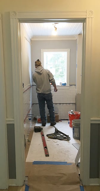 |
| Once again, our tile guy spent serious quality time in our bathroom to crank out the subway tile installation. |
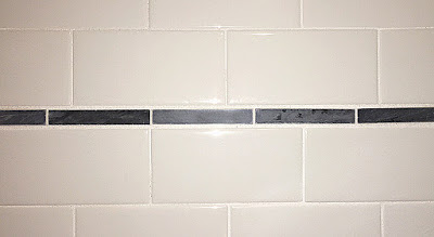 |
| The stripes were made from a bardiglio marble piano till that came on mosaic-style sheets that we cut apart. |
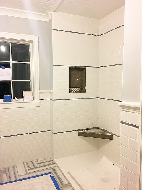
I also wanted a little bit of classic interest on the walls and in my book it doesn’t get much more classic than stripes. Rather than use pencil accent tiles, which can add up quickly, I looked for a gray mosaic tile with a linear shape. After a few missteps that involved falling in love with tile that was discontinued, I found bardiglio marble piano tiles that were each 5/8-inc by 4 inches long and came on a sheet of 18 rows. I only needed four sheets to complete a design incorporating four stripes in the shower and two around the wainscoting in the rest of the room. Figuring out the spacing of the stripes so that they looked right in both sides of the room as well as the height of the tile chair rail was a math problem that gave me a weeklong headache.
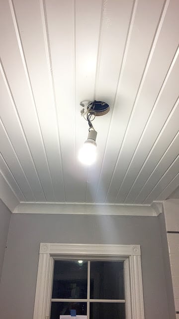 |
| Sorry for the bright lightbulb in your eyes, but here’s a good look at the wood plank ceilings. |
 |
| Benjamin Moore White Heron |
 |
| Benjamin Moore Pebble Beach |
I cranked out a little bit of painting prior to the wall tile installation as well. We went with the same wood plank ceiling that can be found in much of the rest of downstairs and like we had put in the office a few months ago. (See how I painted them here.) The ceilings, trim and doors were painted Benjamin Moore’s White Heron, which was the closest white I could find to the subway tile, leaning a little on the brighter side. I want this whole room to be light and bright so I also went with a light color on the walls: Benjamin Moore Pebble Beach.
Because we used wood plank ceilings, we tiled the ceiling the shower as well. I’ve never been a fan of tiled ceilings, but as soon as it was up, my mind was completely changed. I love the look. The shower niche and the small corner seat will be tiled in the floor tile, but we had to order more, so that will take a bit to finish.
It was another big week in the bathroom, but in the background, not all is well. We are experiencing a somewhat major hiccup that I fear will be difficult to overcome. I’ll tell you all about that next week.
Here are some links to products you’ve seen so far in this renovation:
Floor tile
Shower base
Trim and ceiling paint
Wall color
Subway tile
Wall accent tile (discontinued, but this is similar)
Heated floor
Marble floor sealer
If you want to catch up on previous weeks in this project check here:
Week 1 – The before + the design
Week 2 – Floor tile
And make sure to check out the One Room Challenge featured bloggers and all of my fellow guest participants, all of whom are doing some pretty fabulous things, all organized by Calling it Home.



11 Responses
I'm super impressed with your bathroom so far. Just love it.
So incredible! You made a great choice by going with the classic subway. Though the tiles themselves don't have a lot of visual interest, having the tiles go all the way around the room makes a huge statement!
It looks fabulous! Hope your hiccup turns out to be not as bad as you fear.
Really loving all the tile choices! Looking great.
Thank you, Arielle!
This is already gorgeous! The tile and the ceiling..nothing else matters. Just kidding and I can't wait to see where this goes.
We'd love for you to link up this post with us at Thoughts of Home on Thursday. Our readers would enjoy seeing your progress.
Thanks Stacey!
Too funny- we just took out white subway tile with black edging (not quite stripes, just along the top). Why does yours look so clean and modern and mine just look dated and old? I think its the floor tile you've used – it's so contemporary compared to my penny tile. Yours looks gorgeous!!!!!
I also tiled the ceiling of the shower and love it. My theory is that it "completed" the enclosure, wrapping the tile over the top. Plus we have a bit of a slanted ceiling, so it created a nice flow.
Can't wait to see the vanity and light fixtures. Is that next week?
You know, the same thought crossed my mind when I knew we were going to be doing this and then you tore it out! Thanks for the nice comments. And yep, vanity and lighting is next week … God willing.
Obsessed with that ceiling! It's all coming along so beautifully 🙂
Thanks so much Jenna!