It’s hard to describe the look I was going for in the kitchen. I wanted it to fit with our 1938 cottage and not seem out of place, but I also wanted it to feel updated and maybe even a little modern. I definitely wanted it to feel clean (I like bathrooms and kitchens to feel clean almost to the point of spartan, but not quite).
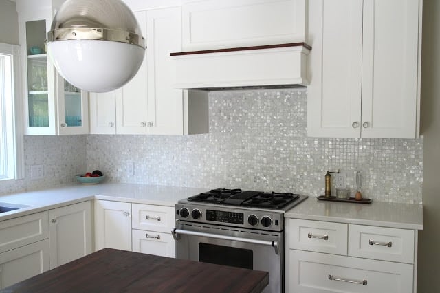
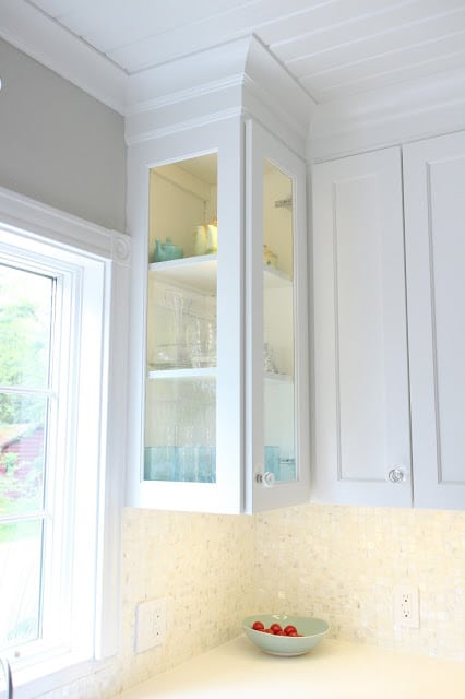
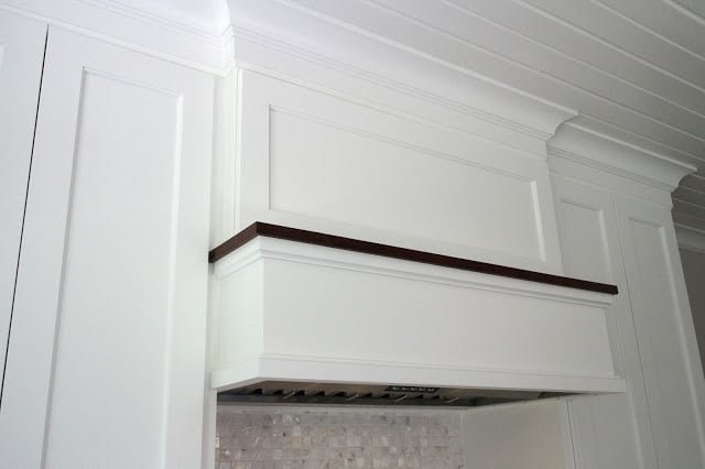
I suppose you could call it transitional, but I sort of hate that label. I wanted a little bit of industrial edge (found mostly in the lighting), a little bit of classic (the cabinets), a little bit of historic (the cabinet glass and cabinet knobs) and a little bit modern (the counters and appliances) all with a handful of “warm” (the range hood and walnut island).
Of course it all took way longer than we had planned and there were some bits and pieces toward the end that just took awhile to finish up.
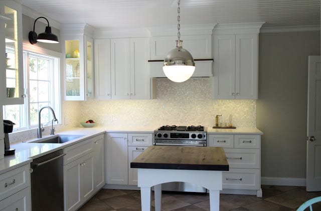
First … a pretty picture to show you what it looks like now.
OK, that was your peek. But first let’s take a look back to what it looked like before. I wish I had pictures from the REAL before, when we first bought the house, but I can’t find any. But here’s a little walk back in time.
BEFORE
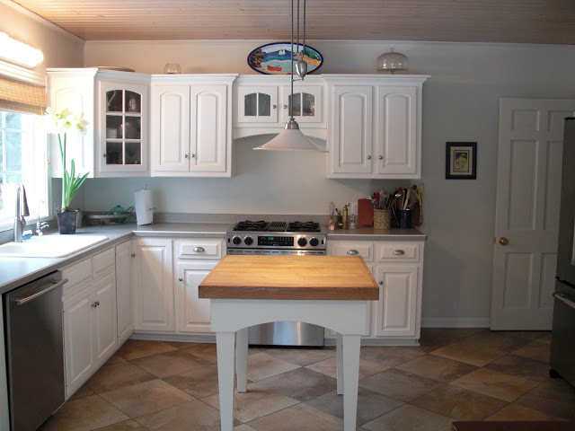 |
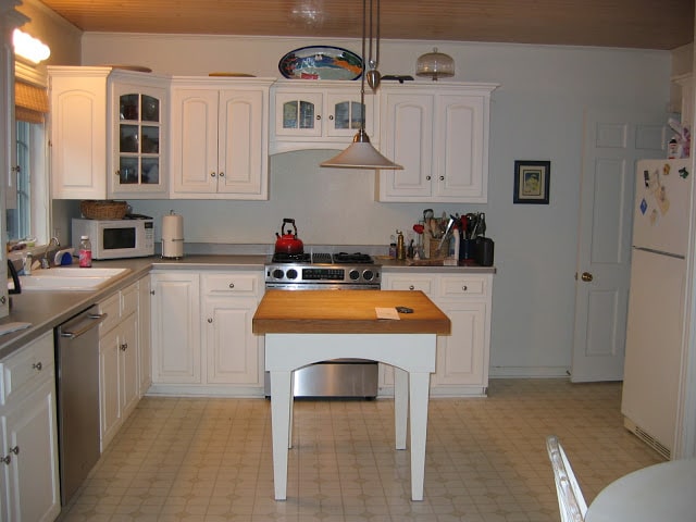
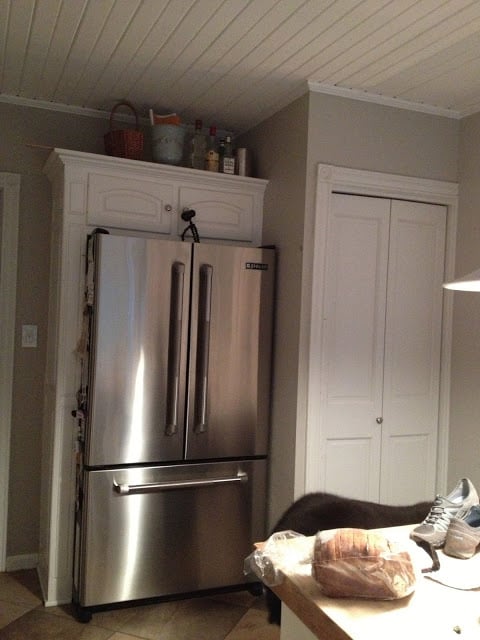
| This was after we put in the tile floor and replaced the appliances but before I painted the ceiling. |
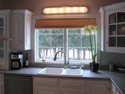 |
| The ugliest light fixture ever. |
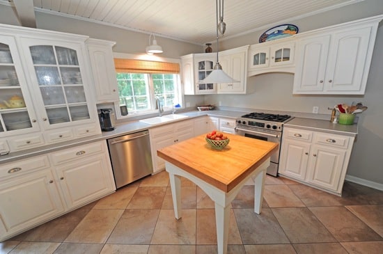 |
| A couple years ago after the light fixture was changed and the ceiling painted. |
|
|
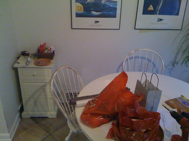
| A very strange angle of what the eating area looked like before we put in the banquette. |
AFTER
What’s new/changed
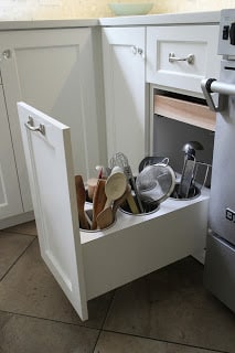
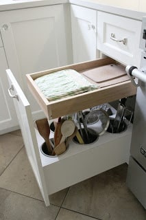
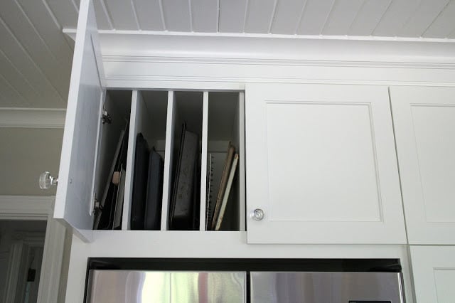
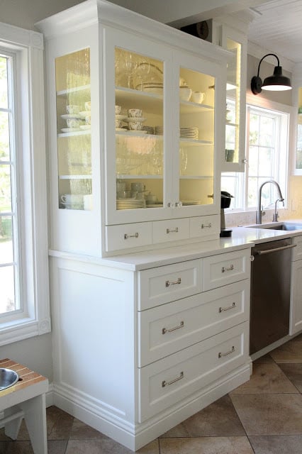
- New cabinets. We originally were going to reface the lowers and replace the uppers (so they would extend to the ceiling) but it turned out to cost just slightly more to do all new cabinets. The old cabinets were recycled to a friend so they didn’t go to waste. We went with custom cabinets built by a fantastic local cabinet maker who also did the built-ins in our bedroom and the banquette bench. I can’t tell you how lucky we are to have found a craftsman to work with on these projects who works so hard for us.
- New countertops. We went with quartz countertops. We wanted the low maintenance of quartz (no sealing, no etching, no staining, no worries) which we’ve loved in our upstairs bathroom. We ended up with Caesarstone only because that’s the company that made the color we liked. I think most of the bigger brands of quartz (Caesarstone, Cambria, Hanstone, Silestone, etc. are created equally).
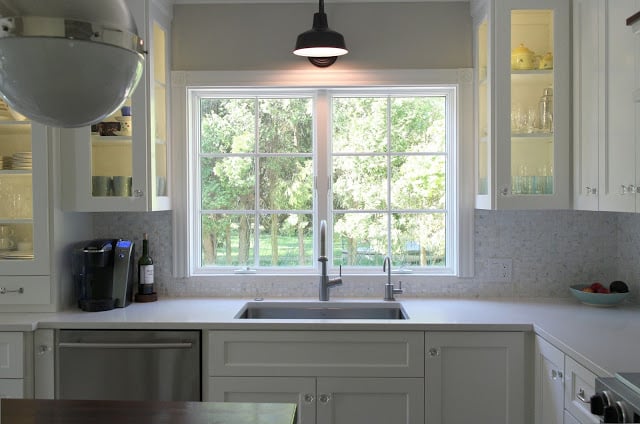
- A new sink. This was a big deal for Mr. Much More Patient, who is also the main dishwasher in the house. It’s a huge stainless steel single bowl sink. Since we have no bathtub in the house I joke that if we ever had a kid, he or she could take a bath in the kitchen sink until about age 10.
- New faucet and a new filtered water faucet.
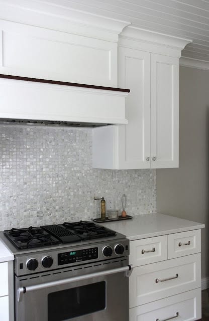
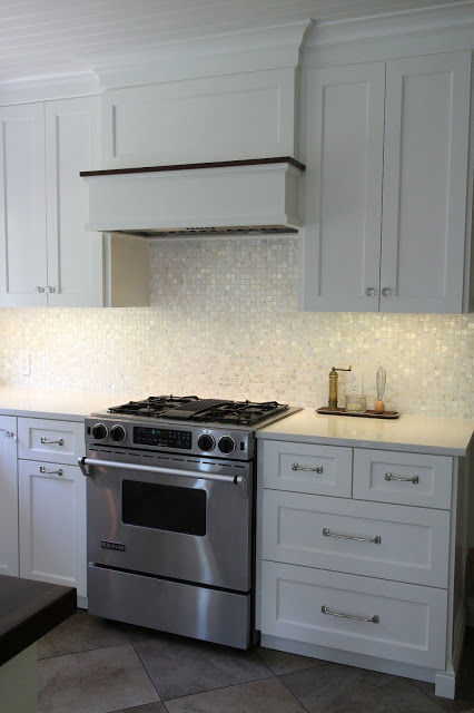
- Overhead vent hood. We got a 36-inch insert and then the cabinet maker built the surround. We currently have a downdraft vent, but we didn’t want to be tied to a specific range when it came time to replace the current range and very few companies make downdraft ranges. We are so happy we did this. It is so great to have a proper vent that works really, really well.
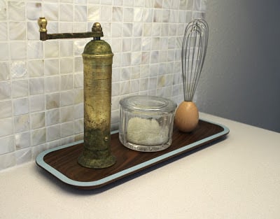
- Tile backsplash. This is the piece de resistance, at least for me. It’s where this kitchen concept started and I think it’s what ties it all together. It is 1-inch mother of pearl mosaic tile with bright white grout. I originally saw it in Coastal Living magazine and contacted the tile store listed in the article’s sources and actually purchased it through them, even though the store was in Key West, Florida.
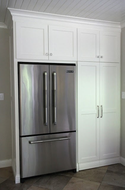
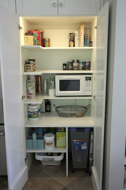
- We removed the small vertical wall by the fridge that originally enclosed the washer and dryer. We moved the laundry facilities to the basement several years ago and used that area as a pantry, but the wall really stuck out into the space.
- We added a garbage disposal. We compost everything we can but I really appreciate not having to clean out the basket strainer. We installed an air switch in the counter to control it which is totally slick.
- A new light over the island. The old one was a little too country for the new kitchen. I also spray painted the light over the sink black. I felt like the black from the other side of the room needed to migrate a little and the white light was getting lost in between the taller cabinets.
- I repainted the ceiling using semi-gloss paint, which was totally worth the pain in the neck. The walls also got repainted in Edgecomb Gray. I loved the Revere Pewter and still love the color in our bedroom but I felt like it was too dark with the tile.
What stayed the same
We didn’t change the floor (tiled about six or seven years ago) or replace any appliances, all of which we’ve replaced since we bought the house 11 years ago. The range is probably 10 years old and the fridge and dishwasher are probably about 7 years old or so. They all work fine (and I hope they continue to for many years to come).
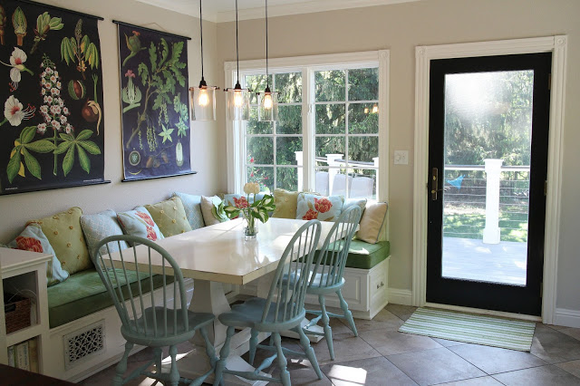
Nothing in the eating area of the kitchen changed, recently anyway.
Info and sources
- Cabinets: Custom, painted Benjamin Moore Cloud White
- Countertops: Caesarstone Eggshell (aka Osprey)
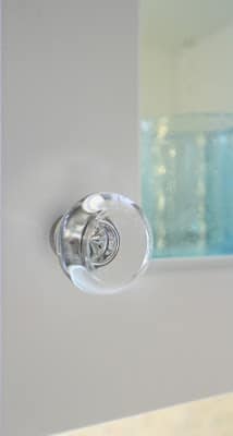
- Hardware: Emtek Georgetown 1.25-inch glass knob and Restoration Hardware Aubrey pulls in polished nickel
- Vent hood: Kobe 36-inch insert (comes with a remote, too)
- Backsplash tile: Mother of pearl 1-inch mosiac tile purchased from Key West Tile. Similar (or possibly the same) tile here.
- Cabinet glass: Bendheim Glass: Soft-seeded mouth blown glass (a splurge but so worth it)
- Thomas O’Brien Large Hicks pendant in polished nickel
- Ceiling paint: Benjamin Moore Cloud White (semi-gloss)
- Wall color: Benjamin Moore Edgecomb Gray
- Sink: 32-inch single-bowl Kraus sink (purchased during a killer Black Friday sale through a site called Express Decor. I think it was less than $250, which is a pretty great price for a 16-gauge stainless steel sink).
- Faucet: Hansgrohe Talis S purchased through Amazon. DO NOT buy from Home Perfect even though they appear to have the best price. That turned out to be a huge nightmare and I had to dispute the charges with my credit card company and ended up buying the faucet from Amazon for about $15 more.


13 Responses
This kitchen is an absolute dream! I am so profoundly impressed. Definitely tucking this away as some-day inspiration.
This is a beautiful kitchen! I love the glass cabinets, looks very nice and I love the lighting in them. I'd like to have a light above my kitchen sink, it's so dark there and I have florescent lighting which is hard on the eyes.
Love all the little details and the built in fridge.
Stunning transformation! What a breathtaking space!
looks great!! Love the cabinets!
It's GORGEOUS!!! Oh man, there is nothing in the world like a newly done/redone kitchen that is JUST the way you want it!!!! Very very nice indeed. Enjoy every minute and every inch!
Your kitchen is wonderful and has so many great features. Your storage is amazing. I found you through P. Allen Smith's newsletter. So glad I did.
Ooh! Perfection!
I love your lighting-I admit that the previous light was ghastly. That looked like it belonged in an eighties-era hair salon.
We decided to paint Alexa's bedroom in Revere Pewter! Strangely in her room it has a pink tinge. Go figure.
I love the lights! They are so much better and the impact is huge! And I serious cool drawer envy. A lot of work, it's impressive. Enjoy!
I don't know where to start, Erin…..there is nothing I would change in this kitchen…..it's stunning! I have mentioned this before, but I love the black trim on the stove hood. And that glass cabinet with the deeper drawers below is amazing. I really didn't think your kitchen needed much to begin with. But you've taken it from ordinary to spectacular. Love it!!
Absolutely beautiful Erin!! The new cabinets really make the room even though on the surface they don't seem much different than the old ones. Having custom cabinets with unique features takes the whole space up a notch. I love the backsplash tile, the hardware, and the lighting…well really all of it LOL. It must be a joy to walk into that room everyday.
It's gorgeous Erin!
I love all of your clever storage, that's a dream for me!
The backsplash is my favorite. It's absolutely stunning.
Really beautiful transformation!!