But I have to say that there are very few television designers who I feel like I actually learn something from. Sarah Richardson is an exception. Maybe it’s because she works with her “sidekick” (I bet he hates that term) Tommy Smythe and the two of them talk about why they are making the decisions they make, but I always pick up a tip or two when watching one of her shows.
HGTV (which apparently has some kind of issue with Sarah because it takes forever to show her series and then they either play them at odd times or burn them off in a weekend) had a mini Sarah 101 marathon yesterday (starting at 7 a.m. CST) so I was thrilled to come home to a DVR filled with Sarah.
Here are a few of the little tips that I picked up from watching some of the shows.
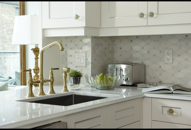
In a very small condo renovation she bought Ikea stock cabinets (almost every kitchen she does is Ikea and they all look amazing) but dressed them up by putting frame fillets (like you would use when framing art) on shaker cabinets. How sharp does that look? I don’t know anyone who would walk into a kitchen that looked like that think those were Ikea cabinets. And you have to love that backsplash.
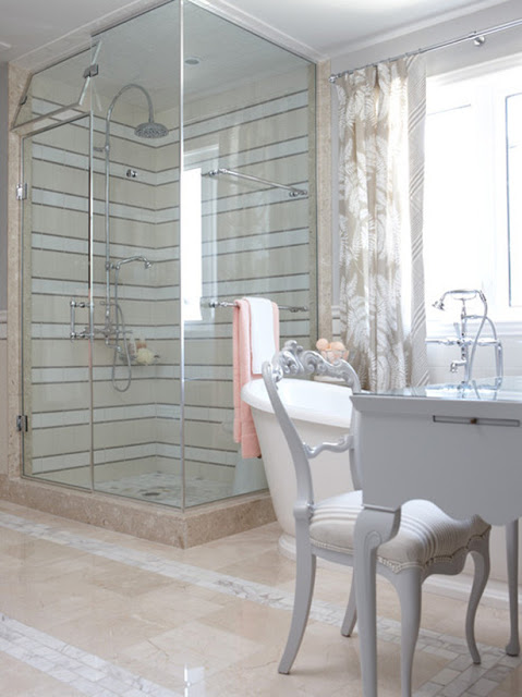
Sarah does the most amazing bathrooms. I think the quality I appreciate most about her design is her ability to combine high and low in a space. She splurges on some items but saves on something else. I can’t tell you how many bathrooms I’ve seen her create where she uses van ordinaire tile from a big box store and combines it in a way that looks totally high end and so cool. Check out this striped shower. Seriously, who comes up with that? And every bit of tile came from Lowe’s. Some day we have to deal with the atrocity that is our pink downstairs bathroom and I aspire to do it on a small budget and try to do something creative like this with tile.
Sarah and Tommy might have coined the phrase “Jumping-off point.” They almost always start with one element in a room and everything else flows from there. That element changes depending on the room, so they never follow other rules that you might have heard such as starting with the rug or the couch or whatever. Often they start with fabric and my favorite scenes are always the ones in the fabric store where they pull out dozens of fabrics and narrow them down. They do an amazing job of combining patterns and colors seemingly effortlessly.
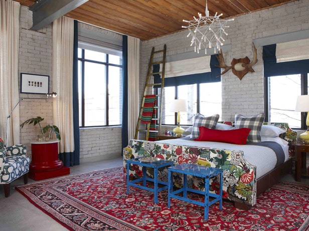
For this bachelor’s master bedroom they started with the white colorway of Schumachers Chiang Mai Dragon (a rather unlikely choice for a masculine room but I love it, and as Sarah said, the idea is that he won’t be a bachelor forever). Every time I start thinking that that fabric is overdone and just ubiquitous to the point of saturation, I see it and my heart goes pitter patter and I know I must have it. What amazed me about this room is how they combined other fabrics with it. The celtic gear-type fabric on the chair (Schumacher Conundrum) is an obvious fit (and I’d combine it with the dragon fabric in a heartbeat if it weren’t $200 a yard!), but never in a million years would I have thought that plaid would go with that fabric. The curtain fabric was $5.99 a yard—that’s Canadian dollars though, so that’s like $5.87 a yard here ;)—which nicely balanced the cost of the expensive Schumacher fabrics. Of course they needed something like 56 yards of drapery fabric so it better be cheap!
There’s no denying, there is a LOT of pattern in this room, but it works for me. One other interesting note: even though there was a large empty wall that the bed could have gone on (to the right of this picture, I think), they put it on a wall with windows, which isn’t the obvious choice in my mind. Sarah said that she believes the best place for a bed is on the wall across from where you walk into the room. Interestingly I think that is really bad feng shui, but I’m not positive.
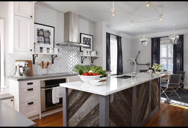
And lastly, she did a contemporary country kitchen for her BFF. Of course, the island is the star here. Putting reclaimed barn wood on an island is hardly a new idea, but I love how she put it in a chevron-type pattern and used the stained boards to break it up (really she did that to keep the raw edges of the barn wood from showing but it’s a great effect). I’m not loving a few things in this room including the floor color (she refinished them so I think going a little darker might have been more to my liking), the bathtub curtain rod light fixture on the ceiling and the spacing of the two lanterns over the round dining table. But that barn wood. Ahhhhh.
 |
| All photos from HGTV Canada |
So what do you think of those rooms? Do you watch any design shows you actually learn something from or is it just about the eye candy?
If you’re loving Sarah’s take on big-box finds, make sure you check out her web series in which she decorates a house entirely with finds from Lowe’s.
OK, enough with the pretty pictures. We’ll be back to my regular old house soon!


5 Responses
Hi,
I have a quick question about your blog, do you think you could e-mail me?
Brian
Heather, I am so jealous that you guys get to see all of Sarah's shows well before we do down here. I remember her early shows. Didn't she have one called Design something? Anyway she and Tommy have definitely got the TV show thing down pat. I recently subscribed to Canadian House and Home (for a pretty penny because of the shipping charges) partly because of Tommy's column. And don't get me started on his fashion designer sister's amazing blazers. I was all set to spring for one until I found out how much they cost!
I've been watching Sarah for about 10 years up here in Canada (she's based out of Toronto) and have learned so much from her in that time. Number One being "the starting off point" and mixing patterns. We're in a bit of a lull with her show right now, waiting for the next "Sarah's House" to air (don't know when, but please be soon).
Tommy has quite a reputation here in Canada being featured in numerous magazines and writing articles now. He is a brilliant designer in his own right. I love watching them work together.
As for the kitchen with the barn board island – I think you're right about the floor colour – it doesn't really go that well with the barnboard – should be more grey toned. But I do like the way she set the barnboard on an angle to match the backsplash – another thing to learn from Sarah – continuity.
I love the color in the bedroom! It makes me happy.
I LOVE Sarah's show too!
It's really one of the few decorating shows I like. I think she does amazing work and her budgets are more realistic than a lot of shows.
I too love her mix of high and low items in every room.