The conversation went something like this:
Furniture girl: How about this one?
Me: Nope. Too tall.
FG: Oh, here’s a nice one. What about this one?
Me: No, the arms are too skinny.
FG: OK, well, we have this one over here that might work.
Me: No, I don’t care for that one either.
FG: This is why I love working with you. You know what you want.
I’m not really sure she meant the first part of that last statement and but I know she had the second part backwards. I rarely know exactly what I want, but I do know what I DON’T want. I know the right “one,” whether it be a sofa, art, lamp or even a husband, when I see it but I don’t know exactly what I’m looking for until I lay eyes on it.
I also don’t do placeholders. Early on in my decorating-my-own-place life I bought an awful Ikea chair that filled a space in a room just because it was cheap. I hated it. It was uncomfortable and kind of ugly and I think it scarred me for life. Since then I’d rather sit there with nothing or use something I already have that I don’t like rather than buy something to fill in “until I find the right one.”
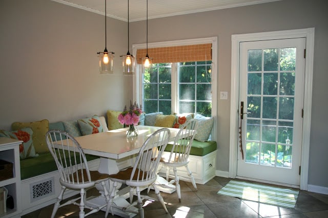
And that’s why the huge wall behind the banquette in the kitchen has been blank for three years. It drives me nuts and every time I show a picture of it I included a little asterisk about how I knew the wall looked stupid blank but I was waiting for the right piece of art to come along.
I can’t tell you how much art I looked at, but none of it spoke to me. I thought about making my own driftwood sculpture or even painting my own canvas, but those certainly would have been disasters.
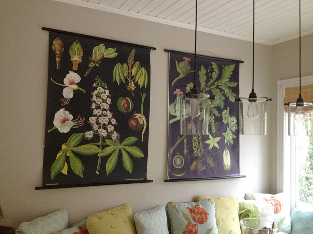
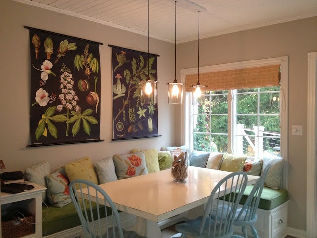
Since the kitchen is one of the most light-filled rooms in the house, I liked the idea of bringing the outside in with some kind of botanical, but I didn’t want anything fussy or formal. And then I (well actually my friend and design sympathizer Roisin) found these vintage German schoolhouse charts at the Etsy store Bonnie and Bell.
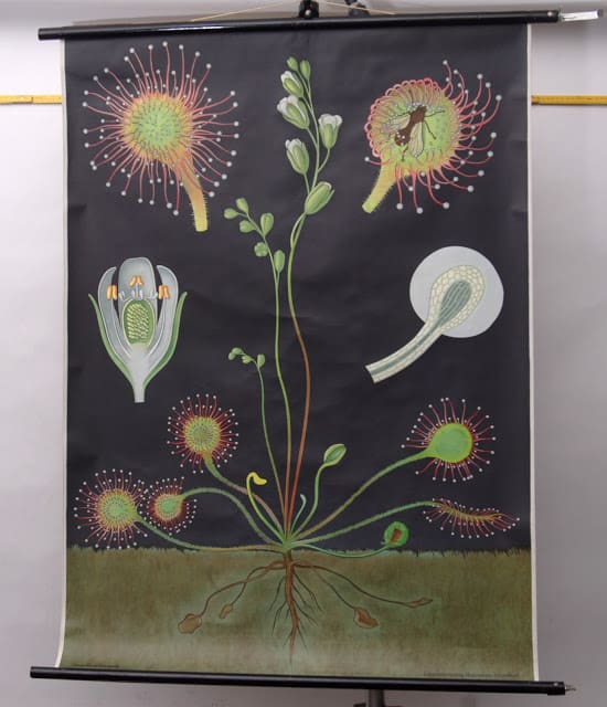
Of course picky old me was not satisfied with the charts that were in the store. No, I needed something special (I told you, I know it when I see it). So I started working with Bonnie and Bell owner Linda to find just the right thing. I swear the woman is a saint. She poured through piles of vintage charts (she has all sorts of contacts in the European antiques world) until we found the oak one on the right. Then it was just a matter of finding the right partner for it. I really loved the colors in the Sundew, but then I did a little research on Sundew and found out it’s a carnivorous plant and as weird as this may sound, I just wasn’t comfortable with a carnivorous plant hanging over my table (visions of “Feed me, Seymour, danced in my head). The same went for some of the zoological charts Linda had. I absolutely love the chickens chart, but I have a hard time thinking about raw poultry while eating much less looking at chicken innards, as pretty as they may be.
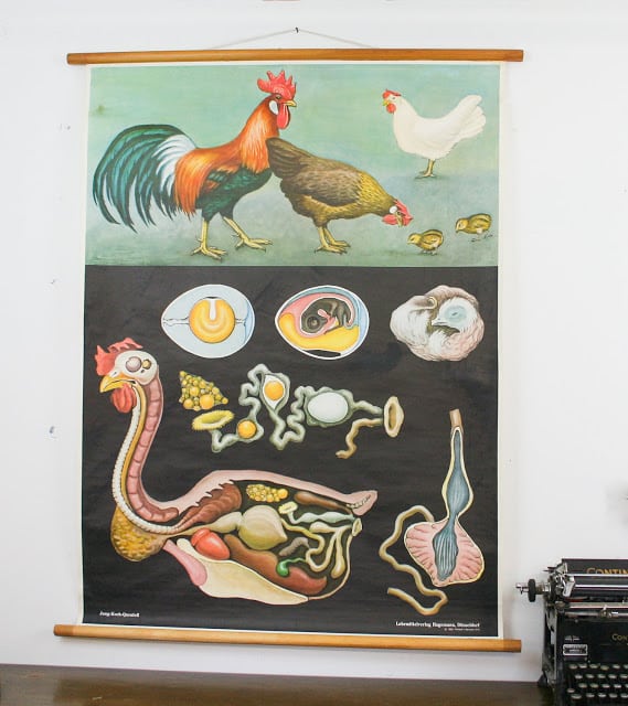 |
| Add caption |
So I did a little research on these old charts and found one that I knew would work: horse chestnut. So Linda set out to find that chart for me and sure enough, in a couple weeks she located it for me!
I was so happy when I unrolled them. They are so lovely and wonderfully but gently worn. It’s completely charming that they aren’t totally perfect. One was printed in 1967 and the other in 1977 so they aren’t THAT old, but just perfectly aged.
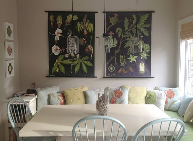
I once heard a designer say that every room can use a little black. Before I hung up the beautiful botanicals, the only black in the entire kitchen was the black cords on the pendants over the table. Originally I was worried that so much black on the wall might overwhelm the room or make it unbalanced, but I think it adds just the right statement to the room and actually makes those cords fit in more.
Check out what it looked like before.
And now after. Which do you prefer?
I’m so happy I waited to find the right thing for that wall. You know it’s right when it just feels like home. And that corner just became my new favorite place in the house.
And one last look from a different angle (where you can see my homemade seed packet art works great with them.
There’s great news to go along with this post. Bonnie and Bell’s Linda (who apparently didn’t tire of me even after I sent her on a wild goose chase) has agreed to work with me on a giveaway. Stay tuned for details!


4 Responses
What a transformation…I like it all and I know you'll be spending a lot of time there!
I've loved these since the first time i saw them in a magazine a number of years ago. They are well worth waiting for! Not only does the black actually make the whole room zing, but the dramatic scale fills that space and pulls the whole room together. Plus it is so nice to have art that relates to the American landscape, and has that nice scientific aspect. And I'm sure the graphic designer in you loves them for all sorts of additional reasons.
Those are incredible on your wall. Love them. I have been sofa hunting for the longest time. So hard to find the perfect one. Glad to have found your blog.
Perfect, Erin, they are just perfect!!!! So worth the wait! I'm almost speechless I love them so much. I keep going back to the image and just staring at them.