Well howdy everyone! I can’t even tell you how crazy the past week has been. I picked up a little side job last week—volunteer, not paid—that took up way more of my “free” time than I expected and then I had several dinners related to an event, and a golf outing. And then, of course, I was busy trying to “style” my house in preparation for the photos for the newspaper’s home and garden section story on our house.
Procrastinator that I am, I was up until 2 a.m. Monday night finishing up the gallery wall. How ridiculous is that? But I was bound and determined to have that area finished, or at least look sort of finished, so I was painting frames, cutting mat board, printing out last minute photos on the home printer (I figured for a photo shoot you can’t tell if it was printed on recycled copy machine paper or fancy photo paper) and believe it or not, sticking a big piece of wood to the wall (you know I have to leave you with a teaser).
And by the time I finished with that I just didn’t care anymore. So I pretty much just jammed anything extraneous in the closets. In the kitchen I took the paper towel holder, the compost bucket, the cutting boards and half the utensils that I keep in a crock on the counter and literally threw them in the pantry along with a half consumed bottle of wine and a couple of the random bottles of alcohol that live on top of the fridge. I’d rather err on the side of bare than cluttered.
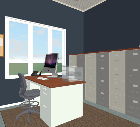
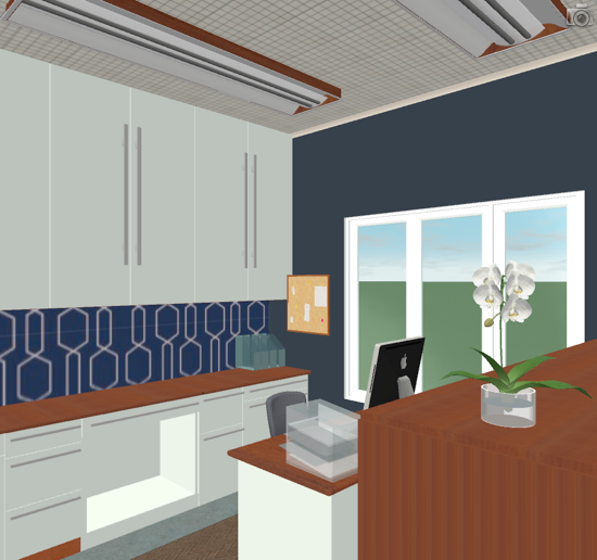
Anyway, I’ll get back to the photo shoot and the story (due out next week, I think) soon, but I thought we could revisit the office project that I mentioned a couple weeks ago. The graphic artist at work and I banged around a few ideas and that clever little lady put them right into the HGTV design software and spit out some renderings, which is pretty darn cool.
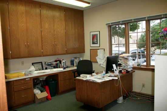
If you’ll recall, here’s my hideous office at work. I’ve gotten preliminary approval to redo it as long as I can get the design approved and that I do (and pay for) the work myself.


A lot of you weighed in with some ideas of what might improve this space and the real hangup was that green carpet. I’ve decided that trying to work with it would be challenging at best and quite possibly horrific. So I’m going to look for an inexpensive large, low-pile area rug that will work to neutralize the space a little.


That opens up a few options. Here’s the leading plan right now:
1. Paint the cabinetry light gray and replace the hardware with something a bit more modern looking.
2. Pull out the countertop (including the sink) and replace it with wood counter sections from Ikea or make my own similar to this.
3. Paint the trim white.
4. Paint the walls navy blue.
5. Remove the top of the desk, paint the bottom of it white, and replace the top with a wood table top (also from Ikea), stained a medium to dark color to match the counters.
6. Wrap the top and exposed side of the file cabinets with stained birch plywood and trim.
7. Possibly wallpaper, stencil or hand paint the backsplash area with a funky pattern that may or may not be repeated on the face of the file cabinets.
It’s still a very rough plan, but I think it achieves a lot of the things I was looking for, namely a fresh, clean space, that is stylish but not overly feminine and still plenty businesslike.
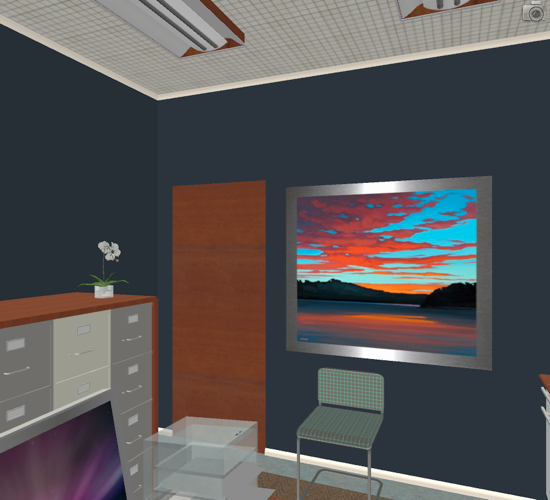
Here’s a view of the rendering showing the one wall I didn’t take pictures of. Please note the art just represents where a piece of art could go, rather than the actual art (no neon sunsets please). Also the guest chair I have in the office looks like it was stolen from the conference room (actually, I think it was) but I’d probably be on the lookout for a chair I could redo to match the room but not look out of place. (Sadly the lights shown in the renderings are very true to life, but short of putting in track lighting, I think they have to stay and changing them out really isn’t in my personal budget.)

The rendering is incredibly helpful when I’m trying to envision this. What do you think of the rough plan?


7 Responses
Love the new look, what a great plan!
It looks like a great plan! Will be such a nice space for work. I love blues and I agree on the fabric/corkboard/file cabs…many great fabrics out there and it is a cheap way to work in some interesting patterns.
Love the new look and am amazed at what one of these design programs does. The wood nicely ties it together. Have you thought about "Flor" carpet tiles. I love their catalog but have not tried them.
Three Acres … oh my gosh, that is a GENIUS idea! I absolutely LOVE it. Practical, much easier than wallpaper or stenciling and a lot more options because it's just a matter of finding a great fabric.
Thank you so much for weighing in. I LOVE it!
I really like the design! What about putting a cork board wrapped with a bold fabric under the cabinets? That would be easy to change out for future users. You can even use fabric on file cabinets:
http://www.apartmenttherapy.com/chicago/painting-fixing-repair/before-after-annes-file-cabinet-makeover-100928
I'm so glad to hear you've had good luck with the Ikea countertops, Tanja. And excellent idea on the rug remnant. I'll check into that, too.
I like this approach, and I heartily endorse the Ikea countertop approach. We used them in our kitchen (as actual countertops), but I was really struck by how easy they would be to use in just about any application. We're really happy with the durability too!
In terms of a rug, I've seen several folks on HGTV lately go buy either a carpet remnant or an actual portion of carpet, and have the edges bound to make an area rug. I really want to try this when we need a custom size (and want to save $$), and it seems like that might be easier than trying to find exactly the right rug for your office.
Good luck!